PRE PRODUCTION
In order to create a poster and dvd cover displaying the conventions of a thriller I decided to look at a variety of professional posters and dvd covers following my intended Genre before starting production. In doing this I gained inspiration and ideas in how i could display the story I had in mind in order to fit the thriller conventions. The main visual codes that immediately struck me were the use of the colour red in all posters, also the dark environment usually surrounding the protagonist creates a mysterious ambiguous feeling for the audience, resulting in thought provoking posters concluding in the audience wandering what the featured person could be thinking of or running from, this is evident in my main inspiration 'Little Red Riding Hood' (2011).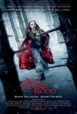 This poster was the main inspiration I used in my production due to my intended story at the time also being about a teenager running through the woods away from former gang members intending to harm him, I thought the surrounding trees were very effective in this poster as the spiky branches could signify the danger the protagonist (little red riding hood) is under, these trees also create a dark intimidating effect resulting in us (the audience) thinking about the danger the featured charter may be facing. Next the eye catching central image of the character dressed in red really stood out to me, I thought this was very effective in leading the viewer into the poster again making us think about the safety of her due to us noticing she is running due to the clever composition of the shot in between the two trees. I thought the size of the trees also caused an intimidating effect on the protagonist possibly reflecting vulnerability, this is emphasised by her dramatic facial expression.

After taking these two posters as my main inspiration in production i proceeded to sketch a rough idea for a possible composition for my poster, including red drips to signify the danger and blood spilt in the film itself. Like in 'Little Red Riding Hood' I placed my protagonist central image running 'Into the woods' literally, i thought this was fitting due to my intended film being named this but also the real photo shoot would capture the intimidating dark environment overlooking my protagonist, capturing the intended feeling of mystery and danger which I hope will effectively follow the thriller conventions.


Next I read a number of screenplays including thrillers such as; 'Pulp Fiction' and 'Gone Girl', both theses scripts followed the key conventions of most thrillers placing ordinary people (shown by environment e.g in 'Gone Girl' ,the first scene features a stereotypical American house) in extraordinary situations ultimately providing the film with the 'thrilling' aspect for the audience . This also allowed me an insight into how the screenplays of renowned professions like David Fincher (Directer of 'Gone Girl') and Quentin Tarantino (director of 'Pulp Fiction') format there screenplays . I proceeded to write a 9 page script using the format i gathered from both professional scripts, resulting in a story in which a first ambiguous teenager named Darren (17) is hunted by his former gang and chased from the local estate 'Into The Woods', bearing in mind my thriller poster and dvd cover had an audience of teenagers I created a teenager living on an estate in order for the character to be relatable to a teenage audience. An extract of my screenplay can be seen under the Pulp Fiction screenplay above, mine clearly displaying the format and description needed for a professional screenplay.
PRODUCTION


 I attempted to capture fear in this particular shot as my character checks behind himself during the chase scene in my film, inserting this picture into both my poster and DVD cover will hopefully show the danger Darren (my protagonist faces as he his hunted down by his former gang. I also thought including clothing brands (e.g: adidas, north face) commonly worn by many teenagers will add to the relatable story.In this shot I captured my protagonist behind bars, symbolising how he feels personally, trapped as he is unable to escape the gang despite his willingness to change due to him deciding to opt out in order to pursue a career as a long distance runner.
I will use this shot for my main image in both my poster and DVD cover, I think I captured my intended composition as it is clear Darren is entering some kind of woodland due to the trees visible in the photo. His clothing also following the stereotypical thought many people may possess of teenagers as his jeans are below his waist and his hood over his head, this immediately becoming relatable to many teenagers due to them possibly dressing this way themselves. I also thought this image was effective in being ambiguous as we are not sure why the featured figure is entering the woods, un aware that really he is out intended to practice cross country running in which we know him to be good at, before he is spotted and hunted down by the gang he recently opted out of.
After gaining the images I wanted in my photo shoot I proceeded to begin creating my poster and DVD cover on professional adobe programme photoshop. Already having some knowledge on photoshop and a clear vision of how i wanted the poster to look aesthetically, the main task was to learn how professional posters/DVD covers are formatted. I overcame this task by researching various low budget english films ( 'My Brother The Devil'-2012 & 'Fishtank'-2009) in order to discover the company that funded/distributed the films, in order for me to accurately create a realistic poster/DVD cover that looked like a professional film. I included 'Verve Pictures' (distributor) and 'British Film Institute' (known for funding low budget British films) in both in order to achieve a realistic outcome, also including ratings and reviews from British magazines/critics 'Sight and Sound' and 'Total Film' to make my outcomes as realistic as possible.


In terms of the aesthetics of the final outcome I believe by using the threshold tool on the images I created a rough sketchy effect symbolising the protagonists situation in this film itself, the font i used called 'Nervous' was also effective in following the conventions of a thriller as it adds to the eerie atmosphere displayed in the various images, while also reflecting the fast pace seen in the film (running) as the sharp lines mirror the sudden intense situation my protagonist Darren experiences in the film. I used an excessive amount of red in my posters to mirror the severe danger Darren attempts to avoid in my films , I think this worked well as all images on my poster/DVD cover show the bold figure of my protagonist due to the contrasting colours of red/white/black allowing the audience an insight into the film through the visual codes provided on both of my outcomes.
 Overall I think I have successfully created a poster and DVD cover that follows the thriller conventions due to use of colour,layout and typography. Both outcomes also being relatable to a teenage audience due to the focus of both outcomes being a 17 year old teenager and the specific brands featured being popular with a modern younger audience.
No comments:
Post a Comment