SOURCE:BBC UK NEWS- http://www.bbc.co.uk/news/uk-england-beds-bucks-herts-35635932

In this weeks news I discovered an article stating how a female referee had been 'verbally abused' after sending someone off while 'refereeing a mens football game', the female referee spoke out saying "He didn't like the decision, so he started hurling abuse at me about my sexuality." I personally thought this article was clear evidence of the on going problem surrounding sexism in the playing and involvement in the nation wide sport of football, due to football largely being considered as a 'mens game'. In sating this there have been many recent cases of women's football becoming increasingly more popular nation wide. One key example of this is how massive sports video game company (EA Sports) have included a game mode in which you can play as women in their most recent release of the most popular football game worldwide 'Fifa '. Even though the problem of sexism in football is still evident in the modern day due to many football fanatics in England focusing on well established clubs who play in the 'Barclays Premier League', I do believe the situation is improving as women's football is becoming increasingly more popular due to being aired on t.v more and more. Global companies like 'EA Sports' also providing awareness of the women's football as they bring the skill that many female footballers possess to the publics attention through extremely popular video games, like 'Fifa 16'. This concluding in a positive representation of women's football as they are credited for the skill they show in game on equal terms with the more popular 'mens football'.
PRE PRODUCTION
In order to create a poster and dvd cover displaying the conventions of a thriller I decided to look at a variety of professional posters and dvd covers following my intended Genre before starting production. In doing this I gained inspiration and ideas in how i could display the story I had in mind in order to fit the thriller conventions. The main visual codes that immediately struck me were the use of the colour red in all posters, also the dark environment usually surrounding the protagonist creates a mysterious ambiguous feeling for the audience, resulting in thought provoking posters concluding in the audience wandering what the featured person could be thinking of or running from, this is evident in my main inspiration 'Little Red Riding Hood' (2011).
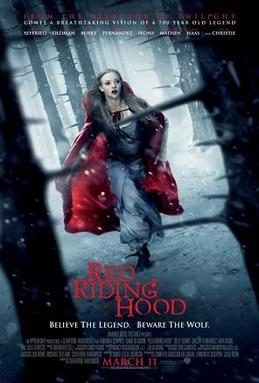 This poster was the main inspiration I used in my production due to my intended story at the time also being about a teenager running through the woods away from former gang members intending to harm him, I thought the surrounding trees were very effective in this poster as the spiky branches could signify the danger the protagonist (little red riding hood) is under, these trees also create a dark intimidating effect resulting in us (the audience) thinking about the danger the featured charter may be facing. Next the eye catching central image of the character dressed in red really stood out to me, I thought this was very effective in leading the viewer into the poster again making us think about the safety of her due to us noticing she is running due to the clever composition of the shot in between the two trees. I thought the size of the trees also caused an intimidating effect on the protagonist possibly reflecting vulnerability, this is emphasised by her dramatic facial expression.

Shutter Island (2010) also provided me with inspiration before starting production and making my poster and dvd cover. One of the main visual codes that immediately stood out to me was the bold red coloured headline, I thought the roughness of the red font could possibly signify danger the may be featured in the film, or even blood that may be spilt through out the thriller. The facial expression captured of protagonist Leonardo DiCaprio was also a factor i liked about the poster, I thought the low level lighting on his face caused me to think about the possible personally the character might possess, as the facial expression could be seen as fear or anger, leaving the audience thought provoked fitting the thriller genre.

After taking these two posters as my main inspiration in production i proceeded to sketch a rough idea for a possible composition for my poster, including red drips to signify the danger and blood spilt in the film itself. Like in 'Little Red Riding Hood' I placed my protagonist central image running 'Into the woods' literally, i thought this was fitting due to my intended film being named this but also the real photo shoot would capture the intimidating dark environment overlooking my protagonist, capturing the intended feeling of mystery and danger which I hope will effectively follow the thriller conventions.

 Next I read a number of screenplays including thrillers such as; 'Pulp Fiction' and 'Gone Girl', both theses scripts followed the key conventions of most thrillers placing ordinary people (shown by environment e.g in 'Gone Girl' ,the first scene features a stereotypical American house) in extraordinary situations ultimately providing the film with the 'thrilling' aspect for the audience . This also allowed me an insight into how the screenplays of renowned professions like David Fincher (Directer of 'Gone Girl') and Quentin Tarantino (director of 'Pulp Fiction') format there screenplays . I proceeded to write a 9 page script using the format i gathered from both professional scripts, resulting in a story in which a first ambiguous teenager named Darren (17) is hunted by his former gang and chased from the local estate 'Into The Woods', bearing in mind my thriller poster and dvd cover had an audience of teenagers I created a teenager living on an estate in order for the character to be relatable to a teenage audience. An extract of my screenplay can be seen under the Pulp Fiction screenplay above, mine clearly displaying the format and description needed for a professional screenplay.
PRODUCTION
After writing my script and becoming familiar with my story, I proceeded to take a range of photos of a teenage male who fit the description of my character perfectly. I took a range of shots due to having the intentions of using images on the front back and inside of my DVD cover, and also due to wanting to produce a double exposure on my poster overlapping images in order to create a thought provoking composition.

 I attempted to capture fear in this particular shot as my character checks behind himself during the chase scene in my film, inserting this picture into both my poster and DVD cover will hopefully show the danger Darren (my protagonist faces as he his hunted down by his former gang. I also thought including clothing brands (e.g: adidas, north face) commonly worn by many teenagers will add to the relatable story.In this shot I captured my protagonist behind bars, symbolising how he feels personally, trapped as he is unable to escape the gang despite his willingness to change due to him deciding to opt out in order to pursue a career as a long distance runner.
 I will use this shot for my main image in both my poster and DVD cover, I think I captured my intended composition as it is clear Darren is entering some kind of woodland due to the trees visible in the photo. His clothing also following the stereotypical thought many people may possess of teenagers as his jeans are below his waist and his hood over his head, this immediately becoming relatable to many teenagers due to them possibly dressing this way themselves. I also thought this image was effective in being ambiguous as we are not sure why the featured figure is entering the woods, un aware that really he is out intended to practice cross country running in which we know him to be good at, before he is spotted and hunted down by the gang he recently opted out of.


